

By Rachel Mecham (Senior Graphic Designer)
If you walk into any political campaign office, scroll through a candidate’s social media page, or pick up a candidate’s mailer, you will likely see the familiar color trio of red, white, and blue—showing how deeply the color code shapes campaign messaging. These colors are unmistakably American, conveying patriotism, tradition, and trust, and they remain a strong and effective choice for many campaigns. However, when nearly everyone uses the same colors, it can be harder for a campaign to stand out. The real opportunity is in using color to create a distinct political identity while still honoring tradition.
Color has a unique power to shape how we feel about an idea before we consciously process it. It all comes down to color psychology. It can make something feel energetic or calm, trustworthy or rebellious, established or innovative. In political design, that power matters because color choices can shape how people perceive a campaign’s identity and the values it represents. That’s why the question is not whether color matters, but how it can help a campaign stand out while still feeling true to its message.
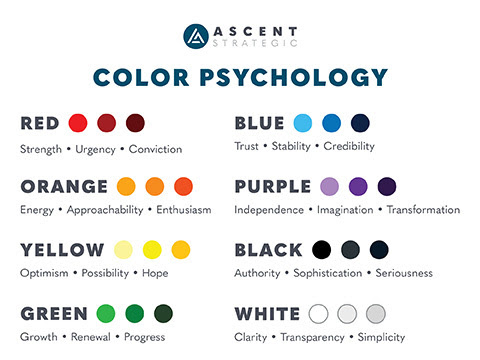
Red, white, and blue carry a powerful history and can be used thoughtfully and effectively. Patriotism isn’t limited to these three colors, though—political designers can also explore the full spectrum when creating visual identities that are distinctive, intentional, and connected to the people and ideas they represent. Looking beyond red, white, and blue opens up more creative possibilities for campaigns while still respecting traditional choices. That opens the door to a broader argument: the right colors should reflect the candidate, the community, and the story being told.
I always get excited when I am designing a client’s branding package. There is a sense of great responsibility that comes with this step because you are creating the visual expression of the candidate’s beliefs, mission, and the issues that matter to them. The first thing I do is create a word map and write out adjectives to help me brainstorm logo concepts and even colors. Let’s look at how I would approach a hypothetical client’s branding.
Jane Doe is running for the Fifth Congressional District of Arizona. She is a sixth-generation Arizonan and has lived in Queen Creek, Arizona, for most of her life. She is a staunch conservative who values limited government, strong families, economic opportunity, and the protection of Arizona’s Western heritage. But Jane is more than a list of political positions. She is deeply connected to the place she calls home. She grew up around the desert landscape and understands the importance of water, agriculture, small businesses, and responsible growth. She wants her campaign to feel Arizona-first, grounded, capable, and authentic rather than looking like another generic political campaign.
Perhaps the palette begins with copper, a natural resource of Arizona and a color that can feel established, durable, and distinctly regional. A warm sand or cream could provide a sense of openness and simplicity. A deep desert green could emphasize growth, roots, and being grounded. Perhaps we look into other options that boldly speak to her confidence and impact on her local community, using bright colors that stand out just as Jane Doe does. Another option could emphasize her steadfast character in a bold, mature tone. We always provide a red, white, and blue option, but we can still align the colors to match the location, mood, and tone. The options are endless!
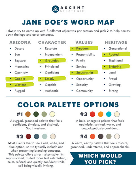
Suddenly, we have a political brand that feels like it belongs somewhere.
And that’s the point.
The colors aren’t random. They’re not different just for the sake of being different. They’re telling part of Jane’s story.
The same exercise could produce an entirely different result for a candidate running for office in Vermont, Maine, New Mexico, or Colorado. The office matters. The candidate matters. The community matters. And perhaps most importantly, place matters. That difference is exactly why color should be chosen with purpose, not habit.
Good political branding doesn’t ask, “What colors should a political candidate use?”
It asks, “What visual language best tells this candidate’s story?”
